
What is Kernel Density Estimation?
Tranditional Histograms
It is very natural to check the density distribution function (PDF) of a random variable through its histogram. But histogram is a very crude density estimator which highly depends on the choice of number and locations of its bars. In the following example, the historical daily returns of hs300 index since Jan. 17, 2011 is studied. By simply varing the number bars of a histogram,
library(PerformanceAnalytics)
library(CAsset)
data(stock_index_daily)
hs300 = stock_index_daily[,'hs300']
par(mfrow=c(2,2))
hist(hs300,breaks=5,main='hs300(5 bars)')
hist(hs300,breaks=15,main='hs300(15 bars)')
hist(hs300,breaks=25,main='hs300(25 bars)')
hist(hs300,breaks=35,main='hs300(35 bars)')
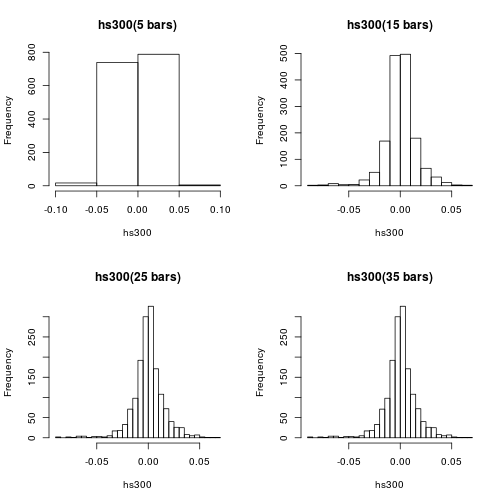
It seems that histogram with larger number of bars may reveal or exhibit better PDF. But it is never so simple. The following are the histograms of the same dataset but with 500 and 1500 bars each.
par(mfrow=c(1,2))
hist(hs300,breaks=500,main='hs300(500 bars)')
hist(hs300,breaks=1500,main='hs300(1500 bars)')
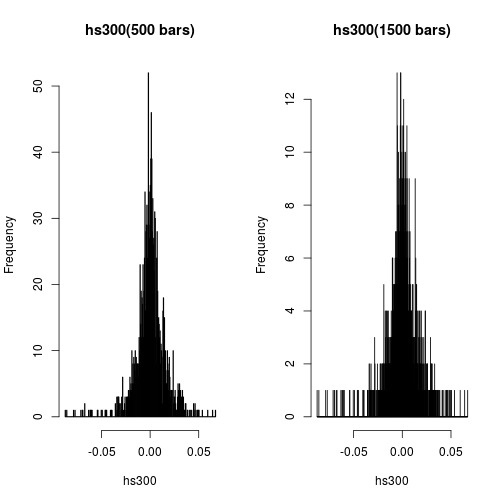
Having more bars just can’t help us to see better pattern on the probability density function.
Kernel Density Estimation
Kernel density estimation (KDE) is a non-parametric method of estimating the PDF of a continuous random variable. It is non-parametric because it does not assume any underlying distribution for the variable. Essentially, at every datum, a kernel function is created with the datum at its centre – this ensures that the kernel is symmetric about the datum. The PDF is then estimated by adding all of these kernel functions and dividing by the number of data to ensure that it satisfies the 2 properties of a PDF:
- Every possible value of the PDF (i.e. the function, f(x)), is non-negative.
- The definite integral of the PDF over its support set equals to 1.
Intuitively, a kernel density estimate is a sum of “bumps”. A “bump” is assigned to every datum, and the size of the “bump” represents the probability assigned at the neighbourhood of values around that datum; thus, if the data set contains
- 2 data at x = 1.5
- 1 datum at x = 0.5 then the “bump” at x = 1.5 is twice as big as the “bump” at x = 0.5, which looks like
x<-c(1.5,1.5,0.5)
n<-length(x)
xgrid<-seq(from=min(x)-1,to=max(x)+1,by=0.01)
h<-0.4
gauss<-function(x) 1/sqrt(2*pi)*exp(-(x^2)/2)
bumps<-sapply(x,function(a) gauss((xgrid-a)/h)/(n*h))
plot(xgrid,rowSums(bumps),ylab=expression(hat(f)(x)),type='l',xlab='x',lwd=2)
rug(x,lwd=2)
out<-apply(bumps,2,function(b)lines(xgrid,b,col='blue'))
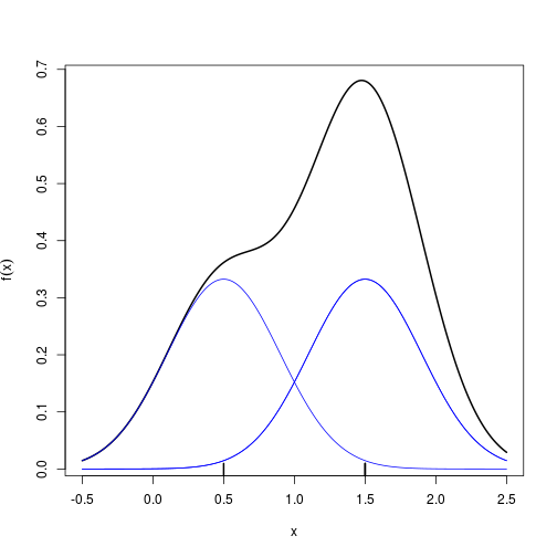
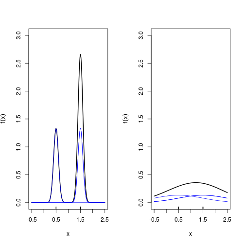
Each “bump” is centred at the datum, and it spreads out symmetrically to cover the datum’s neighbouring values. Each kernel has a bandwidth, and it determines the width of the “bump” (the width of the neighbourhood of values to which probability is assigned, in the above example, $h=0.4$ is the bandwidth). The following example shows that a bigger bandwidth results in a shorter and wider “bump” that spreads out farther from the centre and assigns more probability to the neighbouring values.
par(mfrow=c(1,2))

for(h in c(0.1,1))
{
  bumps<-sapply(x,function(a) gauss((xgrid-a)/h)/(n*h))
  plot(xgrid,rowSums(bumps),ylim=c(0,3),ylab=expression(hat(f)(x)),type='l',xlab='x',lwd=2)
  rug(x,lwd=2)
  out<-apply(bumps,2,function(b)lines(xgrid,b,col='blue'))
}
Constructing a KDE
logically, steps in KDE are very similar to what we did above.
- choose a kernal $k(\cdot)$, which is a simple probability density function. Commonly, Gaussian, uniform (rectangualr), and triangular are chosen.
-
at each datum $x_i$, build the scaled kernel function [ \frac{k((x-x_i)/h)}{h} ]
- add all the individual scaled kernel function and divide by $n$ [ \hat{f}(x)=\frac{\sum_{i=1}^nk((x-x_i)/h)}{nh} ]
The density() function in R computes the values of the kernel density estimate. Applying the plot() function to an object created by density() will plot the estimate. Applying the summary() function to the object will reveal useful statistics about the estimate.
library(stats)
par(mfrow=c(1,3))
for( k in c('gaussian','rectangular','triangular'))
{
  dt = density(hs300,kernel=k)
  plot(dt,main=paste("KDE with",k))
}
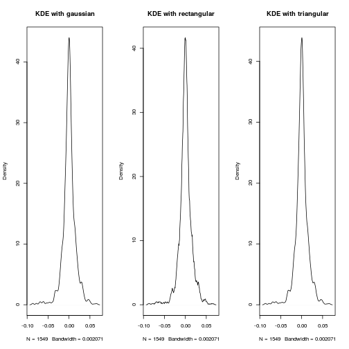
For dataset with thousands of observations, the choice of kernel function is not so cretical. As you may guess from the impression of histogram method, the choice of bandwith $h$ is always a tricky problem.
par(mfrow=c(2,2))
for(bw in c(0.00001,0.0001,0.001,0.01))
{
  dt = density(hs300,bw=bw,kernel = 'gaussian')
  plot(dt,main=paste('KDE with bw=',bw,sep=''),xlim=c(-0.1,0.1))
}
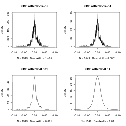
Luckily, there are recommended method to adaptively determine the bandwith, see document for density.
Application in Analyzing China’s Market Returns
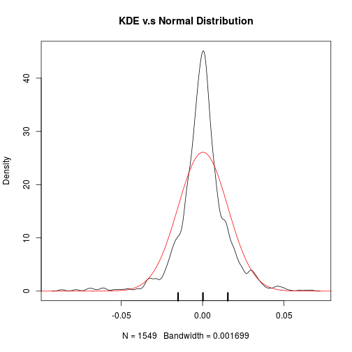
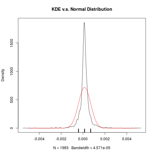
Returns of The Stock Index: HS300
dt = density(hs300,bw="sj")
plot(dt,main='KDE v.s Normal Distribution')
xgrid <-seq (from=-0.1,to=0.1,by=0.0001)
lines(xgrid,dnorm(xgrid,mean=mean(hs300),sd=sd(hs300)),col='red')
x<-c(mean(hs300)-sd(hs300),mean(hs300),mean(hs300)+sd(hs300))
rug(x,lwd=3)
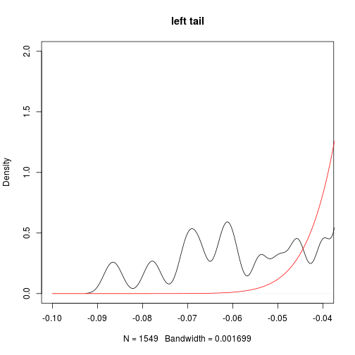
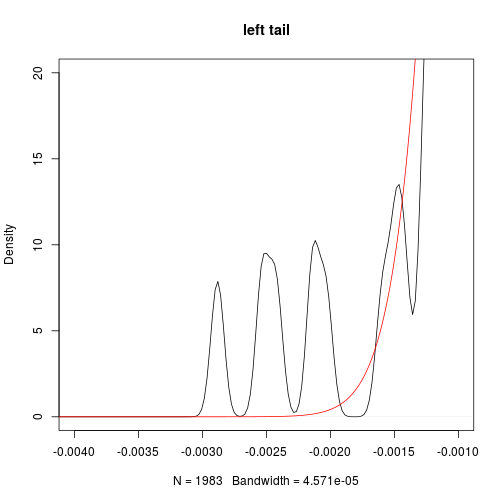
plot(dt,main='left tail',xlim=c(-0.1,-0.04),ylim=c(0,2))
lines(xgrid,dnorm(xgrid,mean=mean(hs300),sd=sd(hs300)),col='red')
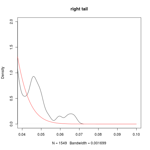
plot(dt,main='right tail',xlim=c(0.04,0.1),ylim=c(0,2))
lines(xgrid,dnorm(xgrid,mean=mean(hs300),sd=sd(hs300)),col='red')
This naturally leads us to look at its kurtosis which is 4.9 far greater than 3 (kurtosis of Normal distribution). As kurtosis can be interpreted as the desgree of dispersion of $x$ around the two values $\mu \pm \sigma$, where $\mu$ is the expectation and $\sigma$ is the standard deviation of $X$.
mean(hs300)
## [1] 0.0002214247
sd(hs300)
## [1] 0.01529462
skewness(hs300)
## [1] -0.595013
kurtosis(hs300)
## [1] 4.910758
So about the daily return of HS300,
- slightly positive growth 0.02%
- highly volatile with sd 1.5%
- negative skewed, i.e. more chance to see large negative return
- fatter tails than Normal distribution
Thus, t distribution, instead of Normal distribution is a better fitted distribution model for the daily returns of China’s stock index: HS300.
Returns of Treasure Bond Index: 000012
data("asset_top_daily")
treasure<-asset_top_daily[,'treasure']
dt=density(treasure)
plot(dt,main='KDE v.s. Normal Distribution')
xgrid <-seq (from=-0.005,to=0.005,by=0.00001)
lines(xgrid,dnorm(xgrid,mean=mean(treasure),sd=sd(treasure)),col='red')
x<-c(mean(treasure)-sd(treasure),mean(treasure),mean(treasure)+sd(treasure))
rug(x,lwd=3)
plot(dt,main='left tail',xlim=c(-0.004,-0.001),ylim=c(0,20))
lines(xgrid,dnorm(xgrid,mean=mean(treasure),sd=sd(treasure)),col='red')
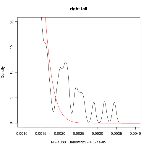
plot(dt,main='right tail',xlim=c(0.001,0.004),ylim=c(0,20))
lines(xgrid,dnorm(xgrid,mean=mean(treasure),sd=sd(treasure)),col='red')
mean(treasure)
## [1] 0.0001414824
sd(treasure)
## [1] 0.0005554525
skewness(treasure)
## [1] -0.1268512
kurtosis(treasure)
## [1] 27.08514
So about the daily return of treasure index,
- slightly positive growth 0.01%
- highly volatile with sd 0.05%
- negative skewed, i.e. more chance to see large negative return
- fatter tails than Normal distribution
Compared with stock index, the treasure index has
- better information ratio (say, better gain with same level of risk)
- even fatter tails (kurtosis is as high as 27, compared with 4.7 of HS300’s daily return)
which means the treasure bonds are safer than stocks as we expected, but may suffer relatively extreme loss more often. This may be due to the tight restriction on interest rates in China.


